The Breitling Story Behind the Reverse Panda Dial
How Breitling’s reverse panda dial evolved from a functional solution for underwater and cockpit legibility into one of the brand’s defining chronograph signatures.
Of all the terms in watchmaking, “panda dial” may be one of the most charmingly literal. Think of a light-colored chronograph dial with two or three dark subdials staring back at you like a panda’s black eye patches. Reverse the colors, with a dark dial and light subdials, and you have—you guessed it—a reverse panda. Simple enough. What is less widely known is that this now-familiar design began with Breitling, not as a style detail, but as a solution to a professional need. Here’s how it went from functional tool to chronograph signature.
The Challenge
In the nascent world of recreational diving, refraction had become a problem. As light passed from water through the watch crystal and across the air inside, it bent, distorting the view of the dial. Hands appeared to be bent and shifted from where they really were. Reflections looked different and the dial became distorted. Combine that with reduced contrast, limited light, glare, viewing angles, and magnification effects… you see where this is going.
Breitling addressed the problem in 1957 with the SuperOcean ref. 807. Until then, no watchmaker had managed to make a chronograph truly dive-ready. The weak point was the pushers, whose openings provided an easy way for water to get into the case. Breitling developed a seal system that kept the case openings watertight.
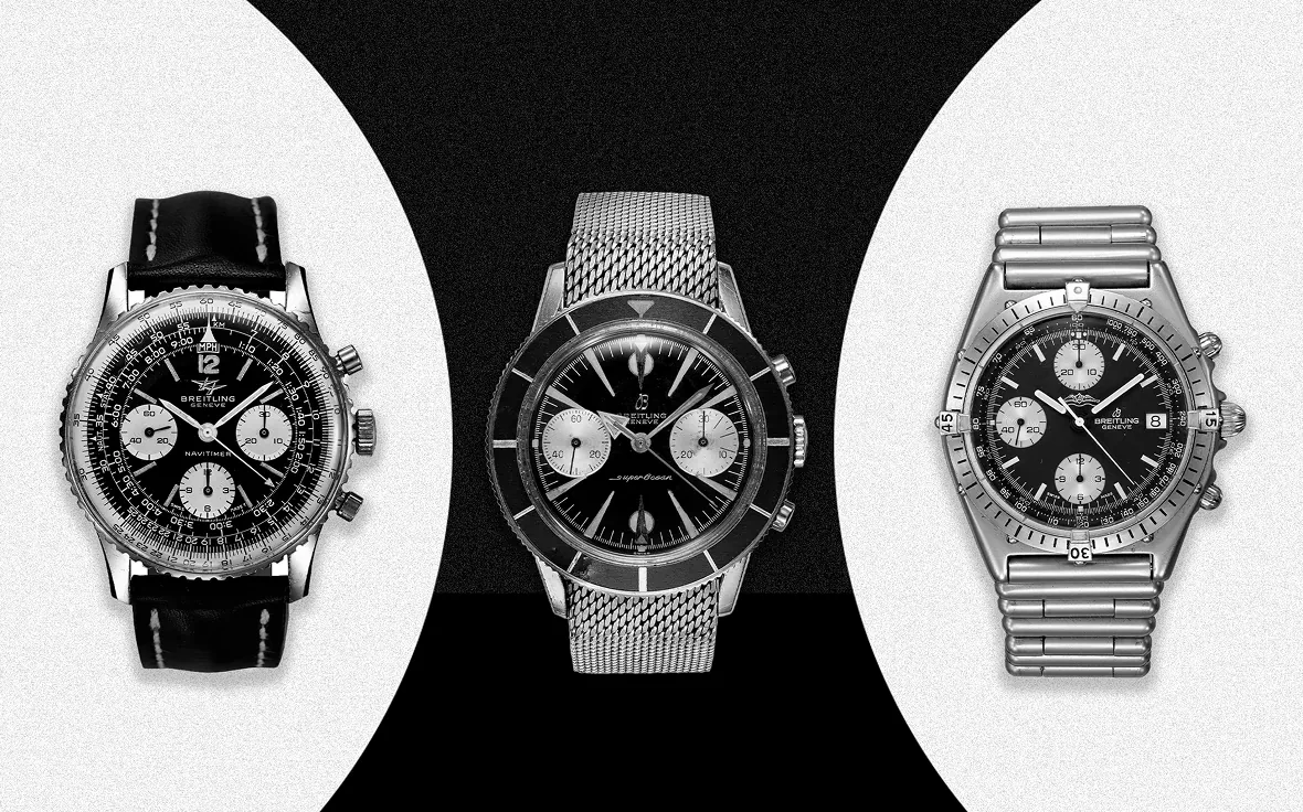
Then came legibility. The ref. 807 paired white subdials with a black dial, creating the first-ever reverse-panda timepiece. White reflects light, after all. But with dive watches still a relatively new idea, using that contrast to make elapsed time easier to read underwater was still a genuine lightbulb moment. The result was a two-for-one breakthrough for divers: precise underwater timing and a highly legible dial.
The Icon Gets a Distinct Look
As the jet age took off in the 1960s, overnight flights became increasingly common, making cockpit visibility in low-light conditions more important than ever. Early Navitimers had all-black dials, including their subdials. In dim conditions, that presented a problem: black absorbs most available light, much like a black sheet of paper disappearing in a darkened room. White, by contrast, reflects more light to the eye.
The ref. 806 models from 1963 onward applied that principle to the cockpit, introducing white subdials against a black dial in the Navitimer for the first time. The all-black Navitimers evolved into a reverse-panda layout.
With time, the design became more than a practical solution. It became a signature. The 1960s reverse panda Navitimers like the one pictured above were notably worn by jazz legend Miles Davis, racecar drivers Jim Clark, Graham Hill, and Jo Siffert, and even the fictional French NATO pilot “Major François Derval,” whose murder set the James Bond Thunderball plot into motion.
In Pop Culture
As it turns out, Thunderball had more than one Breitling cameo. The reverse panda Top Time ref. 2002, introduced in 1964 as a youthful, racing-inspired chronograph, appeared on James Bond’s wrist in the film, the fourth of the franchise. It was the first Q-modified gadget watch worn by the British superspy, complete with a special Geiger counter hidden inside its oversized case.
A little-known fact about Ian Fleming’s iconic superspy is that he’s half Swiss through his mother, Monique Delacroix, a woman from the canton of Vaud, less than 100km away from where Breitling was founded in St. Imier. Who knows, perhaps his Swiss side made him instinctively trust the reliability—and legibility—of Swiss-made chronographs?
Getting the Top Time on Bond’s wrist was a master stroke by Willy Breitling, helping it appeal to an entire generation that saw Bond as a style icon. The Top Time’s high-contrast layout did more than improve legibility from a distance. It announced its identity as a chronograph, with the contrasting subdials almost shouting the watch’s purpose to the viewer. The panda and reverse panda Top Time models from the 1960s reflected the graphic sensibilities of the era, when strong black-and-white contrasts, optical effects, and monochrome compositions became hallmarks of modern visual culture.
Pandas in the Quartz Crisis
Through the decades, Breitling faced deindustrialisation brought by the challenges of the Quartz Crisis, the arrival of inexpensive, accurate quartz movements that challenged the mechanical watch industry. Yet through the turbulence, the appeal of those charming, starkly contrasted dials, introduced with the SuperOcean in 1957, remained steady.
In the mid 1980s, at the peak of the Quartz Crisis, the Breitling Chronomat couldn’t resist getting in on the action, with numerous references in the collection using the iconic panda and reverse panda dials—a look that became synonymous with the brand.
The name “Chronomat” combines two elements that are essential to its identity: “chronograph” and “automatic.” The automatic calibre may be difficult to see from afar (although today we display our own chronograph calibres through a display caseback), but the high-contrast layout turns the chronograph display into a visual statement, making the watch’s purpose instantly recognisable.
Creating a Genre-Defining Identity
It’s not unlikely that another brand would have “discovered” the contrasting color schemes that began with the ref. 807, but someone had to be first. Breitling was uniquely positioned to do so, having spent decades at the forefront of chronograph development, answering to professional demands in the air, on land, and at sea, while pushing the boundaries of design. Like most timepieces produced during the time when form followed function, design was driven by professional demand. Along the way, utility gave birth to a genre-defining identity and style.