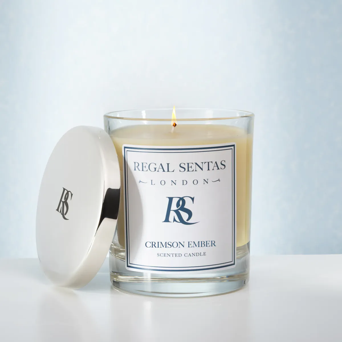
How to Choose a Bedroom Colour Scheme That Actually Calms
Colour in a bedroom is not really decoration. It changes how the room makes a person feel, and since the bedroom is the one space built entirely around rest, the palette deserves to be chosen with intent rather than simply borrowed from whatever the rest of the house happens to be wearing. A living-room colour scheme dragged upstairs without thought is one of the quieter reasons a bedroom fails to feel restful.
Layer one colour family, led by the bed
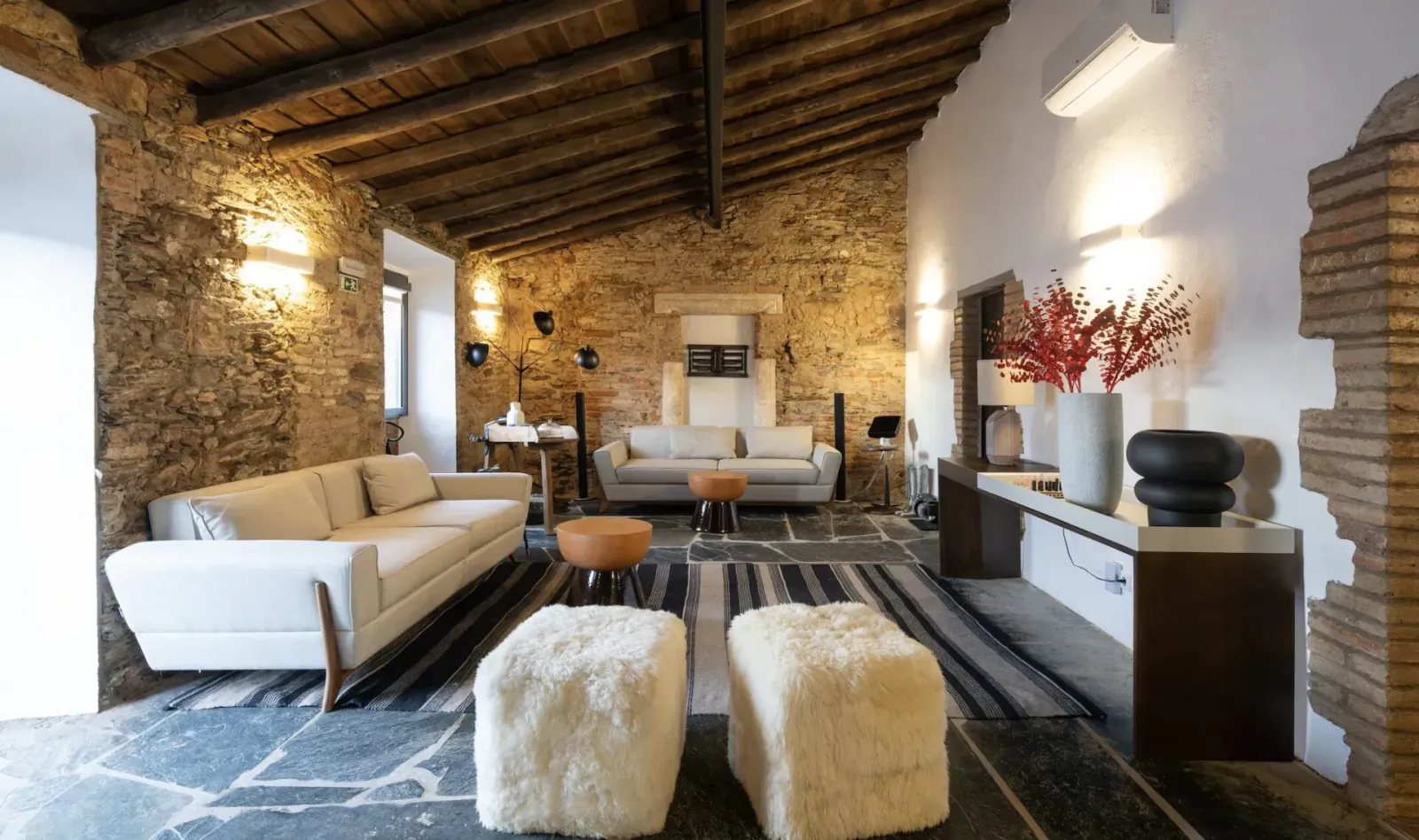
The principle that does most of the heavy lifting is tonal layering. Rather than matching everything exactly, which can look flat, or throwing in clashing accents, which can feel busy, the most reliable approach is to choose one colour family and work through several close shades of it. Soft greys running from pale to charcoal. Warm neutrals moving from cream through to clay. The room reads as cohesive and quiet because nothing jars against anything else, and quiet is exactly the quality a bedroom should have.
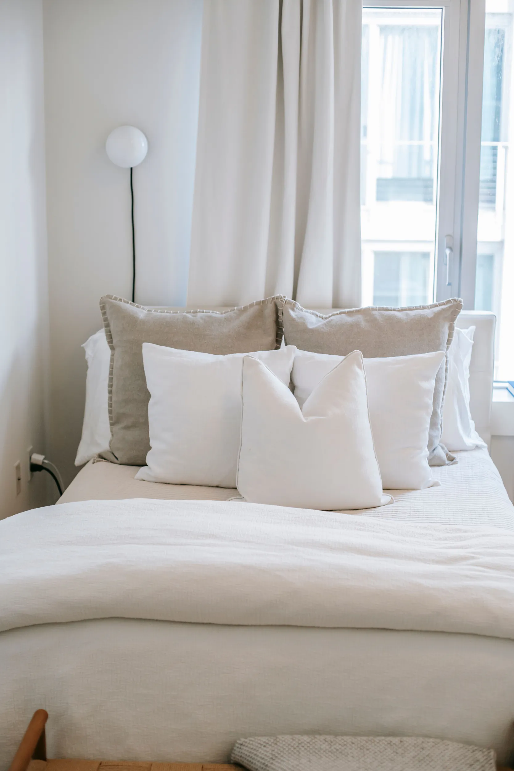
The bed is the largest single field of colour in the room, which means it carries the scheme whether a person plans it that way or not. This is where bedding in tones that pull a bedroom together does real work, because the duvet, the pillows, and a folded throw together cover more surface than any wall in the room. Getting those tones to sit within one harmonious family is what makes the whole space feel resolved rather than accidental. Walls set the backdrop, but it is the bed the eye actually lands on.colour family, led by the bed
The principle that does most of the heavy lifting is tonal layering. Rather than matching everything exactly, which can look flat, or throwing in clashing accents, which can feel busy, the most reliable approach is to choose one colour family and work through several close shades of it. Soft greys running from pale to charcoal. Warm neutrals moving from cream through to clay. The room reads as cohesive and quiet because nothing jars against anything else, and quiet is exactly the quality a bedroom should have.
Mind the undertones
Undertone is the subtle detail that separates a genuinely calm room from one that feels almost right but slightly off. Greys can lean blue or green; whites can lean warm or cool; beiges can pull pink or yellow. Mixing undertones within what should be a harmonious palette is what produces that nagging sense that something is not quite working, even when every individual element looks fine on its own. Holding samples together in the actual room light, both morning and evening, before committing, catches these clashes before they become permanent.
Saturation and texture
Saturation is worth thinking about as carefully as the colour itself. Strong, vivid colour keeps the brain mildly alert, which is the last thing a bedroom needs, so it is best saved for the smallest doses if it appears at all. When a person wants depth or drama in a bedroom, the move is to go darker within the chosen family rather than brighter. A deep tonal navy or a rich charcoal feels enveloping and restful, whereas a bright, high-energy shade on the same wall would feel restless and faintly demanding.
Texture interacts with colour in ways that matter for the final feel of the room. The same shade can read very differently across a matte wall, a soft cotton, a chunky knit, and a smooth linen, and layering those textures within a tight palette adds richness without adding new colours to manage. A monochrome room need not be dull when it is built from a dozen different surfaces, each catching the light a little differently, which is how restraint avoids becoming monotony.
Light, and what is already in the room
Natural light should shape the choice more than most people allow. A room that faces north receives cooler, bluer light, which can make cool greys feel chilly and unwelcoming, so warmer tones often suit it better. A south-facing room floods with warm light and can carry cooler shades comfortably. Testing colours in the specific room, at the times of day it is actually used, prevents the common disappointment of a shade that looked perfect in the shop and turns grim on the wall.
Coherence with the rest of the bedroom’s contents keeps a scheme from unravelling. Flooring, curtains, and any existing furniture all carry colour and undertone of their own, and a palette chosen in isolation can clash with the things already in the room. The most successful bedroom schemes account for what is staying as well as what is changing, folding the fixed elements into the chosen family rather than pretending they are not there.
A sequence to follow
A practical sequence helps when starting from scratch. Choose the dominant tone first, usually the one that will cover the walls and the largest soft surfaces. Then select one or two supporting shades from the same family for the bedding and textiles. Finally, decide whether any small accent is needed at all, and keep it within the family or use it with real restraint. Building the palette in that order, from the largest surfaces down to the smallest, keeps the scheme balanced.
How to add colour safely
For anyone reluctant to commit to a fully tonal scheme, there is a low-risk way to introduce colour without disturbing the calm. Keeping the large, permanent surfaces, the walls, the bed, and the flooring, within a quiet neutral family, and confining colour to small, swappable textiles like a throw or a couple of cushions, allows a room to shift with the seasons or a change of mood at almost no cost. A soft green in spring, a deeper tone in winter, introduced through pieces that are easy to change, gives a bedroom flexibility while protecting the restful foundation underneath. The calm stays put; only the accents move.
A room that calms
The aim of all of this is a room that lowers a person’s pulse a little the moment they walk in. Keep the palette tight, layer the tones, mind the undertones, and let the bed carry the scheme, and the colour does its job almost invisibly. A bedroom palette that announces itself has usually tried too hard; the best ones are barely noticed, which is the highest compliment a room built for rest can earn.